

1. What is the color temperature of light?
The color temperature of light is a parameter that expresses the hue of a light source. The unit of measurement is Kelvin (K).
This parameter determines whether the light has a warm yellow hue, a natural white, or a cool white. In interior design and architecture, color temperature directly affects emotions, visual experience, and the effectiveness of space utilization.
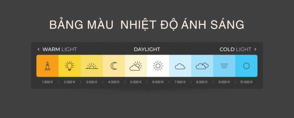
2. Common Color Temperature Ranges
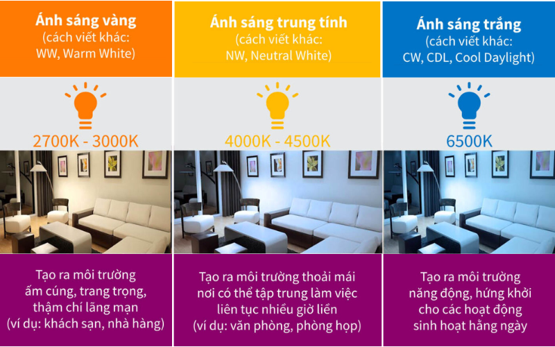
2.1. Warm Yellow Light 2700K – 3000K
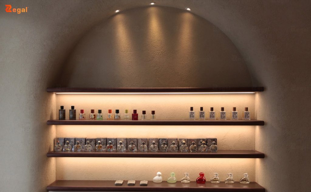
This light range provides a relaxing and comfortable feeling. Yellow light is often used in bedrooms, hotels, lounges, or high-end restaurants.
Spaces using warm light tend to feel more intimate and luxurious.
2.2. Neutral Light 3500K – 4500K
This color temperature range balances warmth and clarity. It’s a popular choice for offices, showrooms, and modern homes.
Neutral light helps interior colors appear more natural.
2.3. Cool White Light 5000K – 6500K
Cool white light provides a sense of clarity and focus. This color range is suitable for hospitals, work areas, or spaces requiring high brightness.
However, overuse of cool lighting in a home can easily create a feeling of lack of warmth and coziness.
Read more about light intensity to understand how to apply it, here.
3. Why is color temperature important in design?
3.1. Impact on emotions
Light can affect human mood. Yellow light creates a relaxing feeling. White light helps increase alertness and concentration.
3.2. Enhanced aesthetic appeal
When the right color temperature is chosen, interior materials and colors will be displayed more accurately. This is especially important for showrooms, hotels, and commercial spaces.
3.3. Optimized visual experience
Combining the right color temperature helps reduce glare and eye strain over long periods.
4. Choosing the Right Color Temperature
4.1. Living Room
3000K to 4000K is recommended to create a balance between relaxation and activity.
4.2. Bedroom
Warm yellow light, around 2700K to 3000K, makes the space more comfortable.
4.3. Office
Neutral or cool white light, around 4000K to 5000K, is recommended to improve concentration.
4.4. Commercial Space
Showrooms and stores often combine various color temperature levels to highlight products.
5. Zegal Translucent Ceilings and Color Temperature Effects
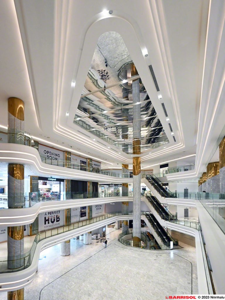
In modern buildings, color temperature is often combined with translucent ceiling systems to enhance lighting effects and spatial depth.
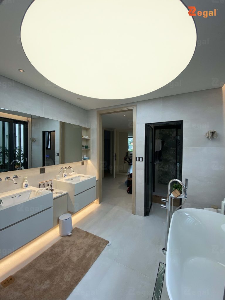
Zegal applies translucent ceiling solutions to distribute light more evenly, reduce glare, and enhance the aesthetics of the building. Depending on the design concept, warm yellow or cool white light will evoke completely different emotions.
When combined with the right color temperature, translucent ceiling systems can create a soft, luxurious effect and enhance the visual experience in hotels, showrooms, or high-end spaces.
6. Conclusion
Light color temperature is not just a technical specification, but also a decisive factor in evoking emotions and the quality of a space. Choosing the right color temperature optimizes the visual experience, enhances aesthetics, and improves practical usability.
When combined with Zegal translucent ceilings, the light becomes softer and has more depth, creating modern and emotionally rich spaces.
Contact Zegal today for advice on the right lighting solution for your project.
——
For further consultation, please contact Zegal Vietnam at the information below:
Zegal Hanoi
112 Vo Chi Cong Street, Nghia Do Ward, Hanoi
Zegal Ho Chi Minh City
319 – C9 Ly Thuong Kiet Street, Phu Tho Ward, Ho Chi Minh City
Hotline: 0969 14 6688