

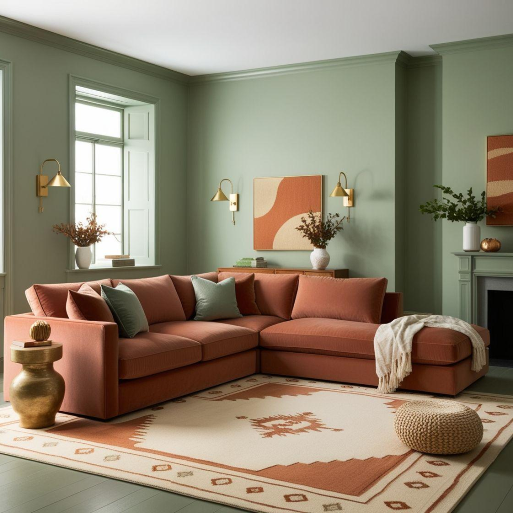
Interior color trends for 2026 are shifting toward natural, warm, and evocative hues. Moving beyond the standard palette of white, gray, or beige, modern design is increasingly favoring greens, earth tones, terracotta, and deep, muted shades. This shift reflects a desire to create living spaces that are relaxing and connected to nature, yet full of character. Colors are also being harmoniously integrated with lighting, materials, and architectural styles.
Learn more about lighting color temperature and its practical applications here.
1. What are the highlights of 2026 interior color trends?
1.1. Natural color palettes continue to reign supreme
2026 sees the rise of nature-inspired color palettes. Shades such as green, wood brown, beige, terracotta, and warm white are being widely adopted. These colors create a warmer, more inviting atmosphere and pair effortlessly with natural materials like wood, stone, and various textiles.
1.2. Colors used to evoke emotion
Interior colors today go beyond mere aesthetics; each hue plays a role in shaping the mood and experience of a space. Bedrooms are well-suited to soothing greens or warm beiges, while living rooms might feature brown, cream, or terracotta tones to foster a sense of intimacy.
1.3. “Cloud Dancer” warm white
“Cloud Dancer” is a standout white shade in the 2026 color trends. It offers a soft, clean look without the coldness often associated with stark, pure whites.
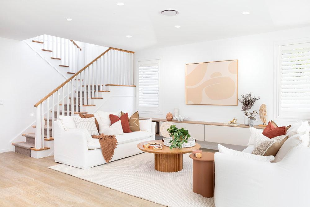
This is a suitable choice for interiors featuring Minimalism, Japandi, and Scandinavian styles. When paired with light-toned wood, linen, or natural stone, the overall look takes on a softer, more inviting quality.
1.4. Warm brown tones add depth to interiors
Warm brown is a standout color palette for 2026 interior design trends. Shades such as chocolate, walnut, caramel, and espresso evoke a sense of luxury while remaining warm and approachable.
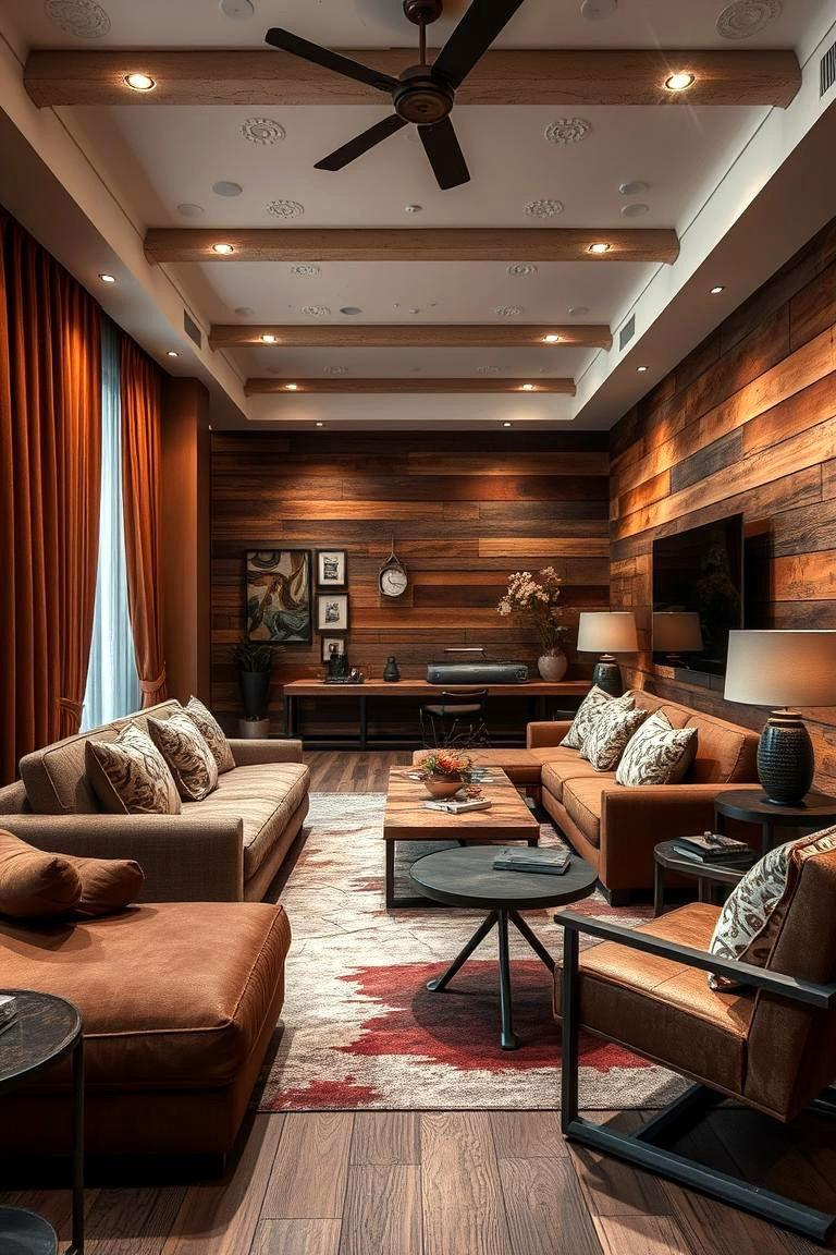
Brown pairs exceptionally well with natural wood. Incorporating stone, leather, or metal adds depth and a sense of sophistication to the space. You can apply brown to cabinetry, tables, sofas, or decorative wall panels; it is not necessary to cover the entire wall surface.
A single section of dark brown is enough to create a striking visual focal point. This approach works well in living rooms, dining areas, and commercial spaces.
1.5. Green: Bringing nature into the space
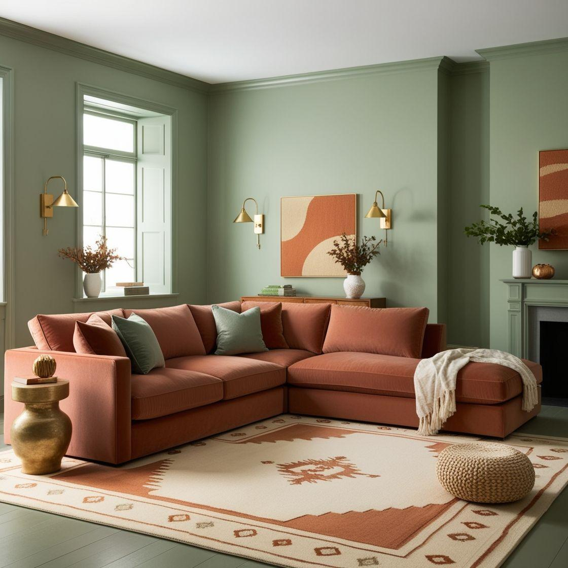
Sage, olive, and eucalyptus greens remain noteworthy choices. These shades offer a balanced, soothing quality and pair easily with various materials. Green fosters a connection to nature, making it particularly suitable for designs focused on relaxation.
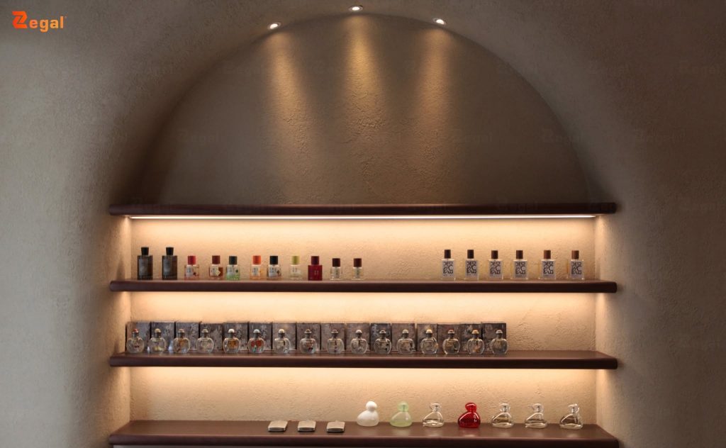
Olive green complements brown wood or cream tones, creating a natural yet dynamic color palette. In modern interiors, green can be featured on sofas, cabinetry, wall panels, or accent walls. Green elements also pair beautifully with warm yellow lighting to enhance the sense of coziness.
1.6. Burgundy and deep red create a luxurious look
Burgundy, Merlot, and wine-red are hues well-suited for distinctive designs. They evoke a sense of richness, luxury, and visual depth. However, these colors should not be overused; deep reds are best employed as accent tones. Burgundy can be incorporated into sofas, armchairs, curtains, rugs, or decorative items. Even a small detail can serve as a striking focal point for the room.
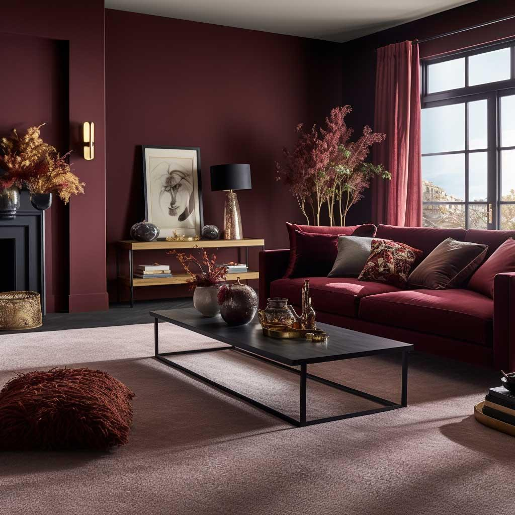
When paired with beige or chocolate brown, the color palette takes on a more luxurious feel. This combination is well-suited to Luxury and Contemporary interior styles.
2. 2026 Interior Color Schemes: The 60-30-10 Rule
The 60-30-10 rule is a simple color-coordination method that creates balance and depth within a space. The dominant color accounts for approximately 60% of the scheme, typically appearing on walls, ceilings, and large surfaces; shades such as warm white, beige, taupe, or pale blue are ideal for establishing this overall backdrop. The secondary color makes up about 30% and is expressed through elements like sofas, curtains, cabinetry, flooring, or interior materials; tones such as wood brown, olive green, and terracotta can facilitate a natural transition between areas. The remaining 10% is reserved for accent colors, which add distinct character and visual interest to the space; hues like burgundy, ochre, or deep blue can be applied to chairs, lighting fixtures, artwork, cushions, or decorative accessories. The 60-30-10 ratio need not be applied rigidly; it can be adjusted based on factors such as spatial dimensions, lighting, materials, and the chosen interior style.
3. Trending interior colors for 2026 by space
3.1. Living room
For the living room, prioritize beige, wood tones, or warm white. Olive green and burgundy work well as accent colors. This combination creates a sense of luxury while remaining inviting. It is also a versatile palette that allows for easy seasonal accessory changes.
3.2. Bedroom
Bedrooms should feature soothing tones. Beige, sage green, pale blue, and warm white are all suitable choices. These colors foster a relaxing atmosphere. Soft yellow lighting further enhances the sense of warmth.
3.3. Kitchen
Kitchens can incorporate beige, wood tones, or olive green. These colors pair well with stone and metal elements. To create visual interest, consider using terracotta or ochre, though these accent colors should be used in moderation.
3.4. Offices and commercial spaces
Offices can utilize blue or sage green to convey professionalism. Commercial spaces might opt for bolder choices like burgundy, terracotta, or ochre. Colors should also align with brand identity to ensure a consistent customer experience.
4. Considerations for choosing interior colors in 2026
4.1. Avoid blindly following trends
Color trends should serve merely as a reference; the final color choice must suit the architecture and functionality of the space. A trending color is not necessarily right for every setting. Prioritize harmony and long-term usability.
4.2. Evaluate colors under actual lighting conditions
Colors viewed on a screen may differ from how they appear in reality, and lighting conditions significantly alter color perception. Therefore, test color samples on-site before proceeding with the project. This is a crucial step to minimize color discrepancies.
4.3. Combining Colors with Materials
Colors look their best when paired with the right materials. Wood, stone, glass, metal, and fabric each create distinct effects. Therefore, the trending interior colors for 2026 should be selected in conjunction with materials. This approach adds depth and cohesion to the overall design.
5. Conclusion
The trending interior colors for 2026 are characterized by natural, warm, and evocative tones. Warm white, beige, wood brown, green, terracotta, and burgundy offer a range of exciting options. The key lies not merely in the choice of color itself, but in how colors, lighting, and materials are harmoniously combined to create a balanced space.
When applied correctly, the 2026 color palette can create interiors that are both modern and full of character. This approach aligns perfectly with interior design trends that prioritize the user experience.
——
For further consultation, please contact Zegal Vietnam using the details below:
Zegal Hanoi
112 Vo Chi Cong, Nghia Do Ward, Hanoi
Zegal Ho Chi Minh City
319 – C9 Ly Thuong Kiet, Phu Tho Ward, Ho Chi Minh City
Hotline: 0969 14 6688